Changing the looks of the visual objects created
Adding color or size variations
- Color:
The color of the objects created by a plotting function can be specified explicitly using the ‘color’ keyword argument of the function. This color is then applied uniformly to all the objects created.
If you want to vary the color across your visualization, you need to specify scalar information for each data point. Some functions try to guess this information: these scalars default to the norm of the vectors, for functions with vectors, or to the z elevation for functions where it is meaningful, such as
surf()orbarchart().This scalar information is converted into colors using the colormap, or also called LUT, for Look Up Table. The list of possible colormaps is:
accent       flag          hot      pubu     set2
autumn       gist_earth    hsv      pubugn   set3
black-white  gist_gray     jet      puor     spectral
blue-red     gist_heat     oranges  purd     spring
blues        gist_ncar     orrd     purples  summer
bone         gist_rainbow  paired   rdbu     winter
brbg         gist_stern    pastel1  rdgy     ylgnbu
bugn         gist_yarg     pastel2  rdpu     ylgn
bupu         gnbu          pink     rdylbu   ylorbr
cool         gray          piyg     rdylgn   ylorrd
copper       greens        prgn     reds
dark2        greys         prism    set1
The easiest way to choose the colormap, most adapted to your visualization is to use the GUI (as described in the next paragraph). The dialog to set the colormap can be found in the Colors and legends node.
To use a custom-defined colormap, for the time being, you need to write specific code, as show in Custom colormap example.
- Size of the glyph:
The scalar information can also be displayed in many different ways. For instance it can be used to adjust the size of glyphs positioned at the data points.
A caveat: Clamping: relative or absolute scaling Given six points positioned on a line with interpoint spacing 1:
x = [1, 2, 3, 4, 5, 6]
y = [0, 0, 0, 0, 0, 0]
z = y
If we represent a scalar varying from 0.5 to 1 on this dataset:
s = [.5, .6, .7, .8, .9, 1]
We represent the dataset as spheres, using
points3d(), and the scalar is mapped to diameter of the spheres:from mayavi import mlab pts = mlab.points3d(x, y, z, s)
By default the diameter of the spheres is not ‘clamped’, in other words, the smallest value of the scalar data is represented as a null diameter, and the largest is proportional to inter-point distance. The scaling is only relative, as can be seen on the resulting figure:
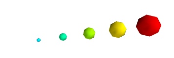
This behavior gives visible points for all datasets, but may not be desired if the scalar represents the size of the glyphs in the same unit as the positions specified.
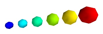
In this case, you shoud turn auto-scaling off by specifying the desired scale factor:
pts = mlab.points3d(x, y, z, s, scale_factor=1)
Warning
In earlier versions of Mayavi (up to 3.1.0 included), the glyphs are not auto-scaled, and as a result the visualization can seem empty due to the glyphs being very small. In addition the minimum diameter of the glyphs is clamped to zero, and thus the glyph are not scaled absolutely, unless you specify:
pts.glyph.glyph.clamping = False
- More representations of the attached scalars or vectors:
There are many more ways to represent the scalar or vector information attached to the data. For instance, scalar data can be ‘warped’ into a displacement, e.g. using a WarpScalar filter, or the norm of scalar data can be extracted to a scalar component that can be visualized using iso-surfaces with the ExtractVectorNorm filter.
- Displaying more than one quantity:
You may want to display color related to one scalar quantity while using a second for the iso-contours, or the elevation. This is possible but requires a bit of work: see Atomic orbital example.
If you simply want to display points with a size given by one quantity, and a color by a second, you can use a simple trick: add the size information using the norm of vectors, add the color information using scalars, create a
quiver3d()plot choosing the glyphs to symmetric glyphs, and use scalars to represent the color:x, y, z, s, c = np.random.random((5, 10)) pts = mlab.quiver3d(x, y, z, s, s, s, scalars=c, mode='sphere') pts.glyph.color_mode = 'color_by_scalar' # Finally, center the glyphs on the data point pts.glyph.glyph_source.glyph_source.center = [0, 0, 0]
Changing the scale and position of objects
Each mlab function takes an extent keyword argument, that allows to set its (x, y, z) extents. This give both control on the scaling in the different directions and the displacement of the center. Beware that when you are using this functionality, it can be useful to pass the same extents to other modules visualizing the same data. If you don’t, they will not share the same displacement and scale.
The surf(), contour_surf(), and barchart() functions, which
display 2D arrays by converting the values in height, also take a
warp_scale parameter, to control the vertical scaling.
Changing object properties interactively
Mayavi, and thus mlab, allows you to interactively modify your visualization.
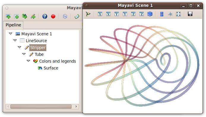
The Mayavi pipeline tree can be displayed by clicking on the mayavi icon
in the figure’s toolbar, or by using show_pipeline() mlab command.
One can now change the visualization using this dialog by double-clicking
on each object to edit its properties, as described in other parts of
this manual, or add new modules or filters by using this icons on the
pipeline, or through the right-click menus on the objects in the
pipeline.
In addition, for every object returned by a mlab function,
this_object.edit_traits() brings up a dialog that can be used to
interactively edit the object’s properties. If the dialog doesn’t show up
when you enter this command, please see Running mlab scripts.