Customizing a View
As shown in the preceding two chapters, it is possible to specify a window in TraitsUI simply by creating a View object with the appropriate contents. In designing real-life applications, however, you usually need to be able to control the appearance and behavior of the windows themselves, not merely their content. This chapter covers a variety of options for tailoring the appearance of a window that is created using a View, including the type of window that a View appears in, the command buttons that appear in the window, and the physical properties of the window.
Specifying Window Type: the kind Attribute
Many types of windows can be used to display the same data content. A form can appear in a window, a wizard, or an embedded panel; windows can be modal (i.e., stop all other program processing until the box is dismissed) or not, and can interact with live data or with a buffered copy. In TraitsUI, a single View can be used to implement any of these options simply by modifying its kind attribute. There are seven possible values of kind:
‘modal’
‘live’
‘livemodal’
‘nonmodal’
‘wizard’ (wx backend only)
‘panel’
‘subpanel’
These alternatives are described below. If the kind attribute of a View object is not specified, the default value is ‘modal’.
Stand-alone Windows
The behavior of a stand-alone TraitsUI window can vary over two significant degrees of freedom. First, it can be modal, meaning that when the window appears, all other GUI interaction is suspended until the window is closed; if it is not modal, then both the window and the rest of the GUI remain active and responsive. Second, it can be live, meaning that any changes that the user makes to data in the window is applied directly and immediately to the underlying model object or objects; otherwise the changes are made to a copy of the model data, and are only copied to the model when the user commits them (usually by clicking an OK or Apply button; see Command Buttons: the buttons Attribute). The four possible combinations of these behaviors correspond to four of the possible values of the ‘kind ‘ attribute of the View object, as shown in the following table.
Matrix of TraitsUI windows
not modal |
modal |
|
|---|---|---|
not live |
||
live |
All of these window types are identical in appearance. Also, all types support the buttons attribute, which is described in Command Buttons: the buttons Attribute. Usually, a window with command buttons is called a dialog box.
Wizards
Note
Wizard views are only supported with the WX backend!
Unlike a standalone window, whose contents appear as a single page or a tabbed display, a wizard window presents the view’s Groups as a series of pages that a user must navigate sequentially. (For more information about breaking up a view into groups, see The Group Object.)
Example 3.1: Displaying a view the “wizard” style
# wizard.py -- Example of a traits-based wizard UI

from traits.api import HasTraits, Str
from traits.etsconfig.api import ETSConfig
from traitsui.api import Item, View, VGroup


class Person(HasTraits):
    first_name = Str()
    last_name = Str()

    company = Str()
    position = Str()

    view = View(
        VGroup(Item("first_name"), Item("last_name")),
        VGroup(Item("company"), Item("position")),
    )


person = Person(
    first_name='Postman',
    last_name='Pat',
    company="Enthought",
    position="Software Developer",
)


if ETSConfig.toolkit == "wx":
    # Wizard window is currently only available for wx backend.
    person.configure_traits(kind='wizard')
leads to the following 2 modal dialogs:
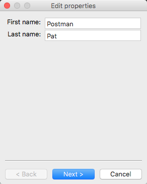
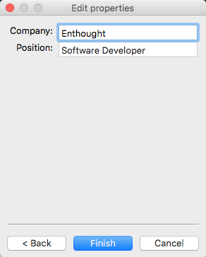
TraitsUI Wizards are always modal and live. They always display a standard wizard button set; i.e., they ignore the buttons View attribute. In short, wizards are considerably less flexible than windows, and are primarily suitable for highly controlled user interactions such as software installation.
Panels and Subpanels
Both dialog boxes and wizards are secondary windows that appear separately from the main program display, if any. Often, however, you might need to create a window element that is embedded in a larger display. For such cases, the kind of the corresponding View object should be ‘panel’ or ‘subpanel ‘.
A panel is very similar to a window, except that it is embedded in a larger window, which need not be a TraitsUI window. Like windows, panels support the buttons View attribute, as well as any menus and toolbars that are specified for the View (see Menus and Menu Bars). Panels are always live and nonmodal.
A subpanel is almost identical to a panel. The only difference is that subpanels do not display command buttons even if the View specifies them.
Command Buttons: the buttons Attribute
A common feature of many windows is a row of command buttons along the bottom of the frame. These buttons have a fixed position outside any scrolled panels in the window, and are thus always visible while the window is displayed. They are usually used for window-level commands such as committing or cancelling the changes made to the form data, or displaying a help window.
In TraitsUI, these command buttons are specified by means of the View object’s buttons attribute, whose value is a list of buttons to display. [6] Consider the following variation on Example 3:
Example 4: Using a View object with buttons
# configure_traits_view_buttons.py -- Sample code to demonstrate
# configure_traits()

from traits.api import HasTraits, Str, Int
from traitsui.api import CancelButton, Item, OKButton, View


class SimpleEmployee(HasTraits):
    first_name = Str()
    last_name = Str()
    department = Str()

    employee_number = Str()
    salary = Int()


view1 = View(
    Item(name='first_name'),
    Item(name='last_name'),
    Item(name='department'),
    buttons=[OKButton, CancelButton],
)

sam = SimpleEmployee()
sam.configure_traits(view=view1)
The resulting window has the same content as before, but now two buttons are displayed at the bottom: OK and Cancel:
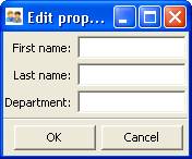
Figure 4: User interface for Example 4
There are six standard buttons defined by TraitsUI. Each of the standard buttons has matching a string alias. You can either import and use the button names, or simply use their aliases:
Command button aliases
Button Name |
Button Alias |
|---|---|
UndoButton |
‘Undo’ |
ApplyButton |
‘Apply’ |
RevertButton |
‘Revert’ |
OKButton |
‘OK’ (case sensitive!) |
CancelButton |
‘Cancel’ |
Alternatively, there are several pre-defined button lists that can be imported from traitsui.menu and assigned to the buttons attribute:
OKCancelButtons =
[OKButton, CancelButton]ModalButtons =
[ApplyButton, RevertButton, OKButton, CancelButton, HelpButton]LiveButtons =
[UndoButton, RevertButton, OKButton, CancelButton, HelpButton]
Thus, one could rewrite the lines in Example 4 as follows, and the effect would be exactly the same:
from traitsui.menu import OKCancelButtons

    ...
    buttons=OKCancelButtons,
)
The special constant NoButtons can be used to create a window or panel
without command buttons. While this is the default behavior, NoButtons can
be useful for overriding an explicit value for buttons. You can also specify
buttons = [] to achieve the same effect. Setting the buttons attribute
to an empty list has the same effect as not defining it at all.
It is also possible to define custom buttons and add them to the buttons list; see Custom Command Buttons for details.
Other View Attributes
Attributes of View, by category
- Window display
These attributes control the visual properties of the window itself, regardless of its content.
- dock: {‘fixed’, ‘horizontal’, ‘vertical’, ‘tabbed’}
The default docking style to use for sub-groups of the view. The following values are possible:
‘fixed’: No rearrangement of sub-groups is allowed.
‘horizontal’: Moveable elements have a visual “handle” to the left by which the element can be dragged.
‘vertical’: Moveable elements have a visual “handle” above them by which the element can be dragged.
‘tabbed’: Moveable elements appear as tabbed pages, which can be arranged within the window or “stacked” so that only one appears at at a time.
- height: int or float
Requested height for the view window, as an (integer) number of pixels, or as a (floating point) fraction of the screen height.
- icon: str
The name of the icon to display in the dialog window title bar.
- image: Image
The image to display on notebook tabs.
- resizable: bool
Can the user resize the window?
- scrollable: bool
Can the user scroll the view? If set to True, window-level scroll bars appear whenever the window is too small to show all of its contents at one time. If set to False, the window does not scroll, but individual widgets might still contain scroll bars.
- statusbar:
Status bar items to add to the view’s status bar. The value can be:
None: No status bar for the view (the default).
string: Same as
[StatusItem(name=string)].StatusItem: Same as
[StatusItem].[[StatusItem|string], ... ]: Create a status bar with one field for each StatusItem in the list (or tuple). The status bar fields are defined from left to right in the order specified. A string value is converted to:StatusItem(name=string):
- style:
The default editor style of elements in the view.
- title: str
Title for the view, displayed in the title bar when the view appears as a secondary window (i.e., dialog or wizard). If not specified, “Edit properties” is used as the title.
- width: int or float
Requested width for the view window, as an (integer) number of pixels, or as a (floating point) fraction of the screen width.
- x, y: int or float
The requested x and y coordinates for the window (positive for top/left, negative for bottom/right, either pixels or proportions)
- Command
TraitsUI menus and toolbars are generally implemented in conjunction with custom Handlers; see Menus and Menu Bars for details.
- buttons:
List of button actions to add to the view. The traitsui.menu module defines standard buttons, such as OKButton, and standard sets of buttons, such as ModalButtons, which can be used to define a value for this attribute. This value can also be a list of button name strings, such as
['OK', 'Cancel', 'Help']. If set to the empty list, the view contains a default set of buttons (equivalent to LiveButtons: Undo/Redo, Revert, OK, Cancel, Help). To suppress buttons in the view, use the NoButtons variable, defined in traitsui.menu.- close_result:
What result should be returned if the user clicks the window or dialog close button or icon?
- handler:
The Handler object that provides GUI logic for handling events in the window. Set this attribute only if you are using a custom Handler. If not set, the default Traits UI Handler is used.
- key_bindings:
The set of global key bindings for the view. Each time a key is pressed while the view has keyboard focus, the key is checked to see if it is one of the keys recognized by the KeyBindings object.
- menubar:
The menu bar for the view. Usually requires a custom handler.
- model_view:
The factory function for converting a model into a model/view object.
- on_apply:
Called when modal changes are applied or reverted.
- toolbar:
The toolbar for the view. Usually requires a custom handler.
- updated: Event
Event when the view has been updated.
- Content
The imports and drop_class attributes control what objects can be dragged and dropped on the view.
- content:
The top-level Group object for the view.
- drop_class:
Class of dropped objects that can be added.
- export:
The category of exported elements.
- imports:
The valid categories of imported elements.
- object:
The default object being edited.
- User help
- help: (deprecated)
The help attribute is a deprecated way to specify that the View has a Help button. Use the buttons attribute instead (see Command Buttons: the buttons Attribute for details).
- help_id:
The help_id attribute is not used by Traits, but can be used by a custom help handler.
- Unique
- id:
The id attribute is used as a key to save user preferences about a view, such as customized size and position, so that they are restored the next time the view is opened. The value of id must be unique across all Traits-based applications on a system. If no value is specified, no user preferences are saved for the view.
Footnotes