Interactive plotting with Chaco
Overview
This tutorial is an introduction to Chaco. We’re going to build several mini-applications of increasing capability and complexity. Chaco was designed to be used primarily by scientific programmers, and this tutorial requires only basic familiarity with Python.
Knowledge of NumPy can be helpful for certain parts of the tutorial. Knowledge of GUI programming concepts such as widgets, windows, and events is helpful, but it is not required.
This tutorial demonstrates using Chaco with Traits(UI), so knowledge of the Traits User Manual framework is also helpful. We don’t use very many sophisticated aspects of Traits or TraitsUI, and it is entirely possible to pick it up as you go through the tutorial.
It’s also worth pointing out that you don’t have to use TraitsUI in order to use Chaco – you can integrate Chaco components directly with Qt or wxPython – but for this tutorial, we use TraitsUI to make things easier.
Goals
By the end of this tutorial, you will have learned how to:
create plots of various types
arrange plots in various layouts
configure and dynamically modify your plots using TraitsUI
interact with plots using tools
create custom, stateful tools that interact with mouse and keyboard
Introduction
Chaco is a plotting application toolkit. This means that it can build both static plots and dynamic data visualizations that let you interactively explore your data. Here are four basic examples of Chaco plots:
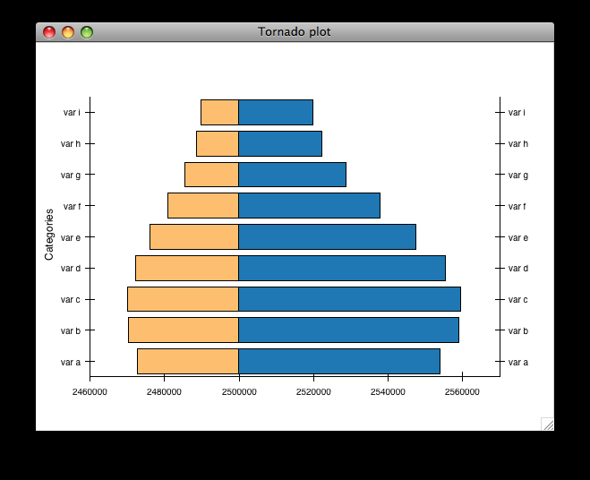
This plot shows a static “tornado plot” with a categorical Y axis and continuous X axis. The plot is resizable, but the user cannot interact or explore the data in any way.
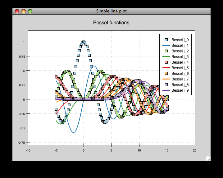
This is an overlaid composition of line and scatter plots with a legend. Unlike the previous plot, the user can pan and zoom this plot, exploring the relationship between data curves in areas that appear densely overlapping. Furthermore, the user can move the legend to an arbitrary position on the plot, and as they resize the plot, the legend maintains the same screen-space separation relative to its closest corner.
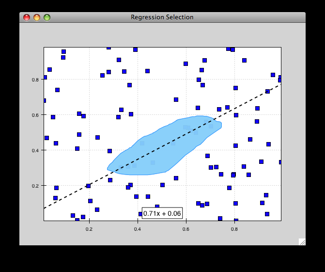
This example starts to demonstrate interacting with the data set in an exploratory way. Whereas interactivity in the previous example was limited to basic pan and zoom (which are fairly common in most plotting libraries), this is an example of a more advanced interaction that allows a level of data exploration beyond the standard view manipulations.
With this example, the user can select a region of data space, and a simple line fit is applied to the selected points. The equation of the line is then displayed in a text label.
The lasso selection tool and regression overlay are both built in to Chaco, but they serve an additional purpose of demonstrating how one can build complex data-centric interactions and displays on top of the Chaco framework.
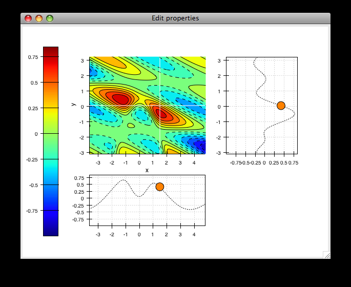
This is a much more complex demonstration of Chaco’s capabilities. The user can view the cross sections of a 2-D scalar-valued function. The cross sections update in real time as the user moves the mouse, and the “bubble” on each line plot represents the location of the cursor along that dimension. By using drop-down menus (not show here), the user can change plot attributes like the colormap and the number of contour levels used in the center plot, as well as the actual function being plotted.
Script-oriented plotting
We distinguish between “static” plots and “interactive visualizations” because these different applications of a library affect the structure of how the library is written, as well as the code you write to use the library.
Here is a simple example of the “script-oriented” approach for creating a static plot for which we use Matplotlib. This approach will also probably look familiar to anyone who has used Gnuplot or MATLAB:
1 2 3 4 5 6 7 8 9 10 | from numpy import linspace, pi, sin import matplotlib.pyplot as plt x = linspace(-2*pi, 2*pi, 100) y = sin(x) plt.plot(x, y, "r-") plt.title("First plot") plt.ylabel("sin(x)") plt.show() |
This creates this plot:
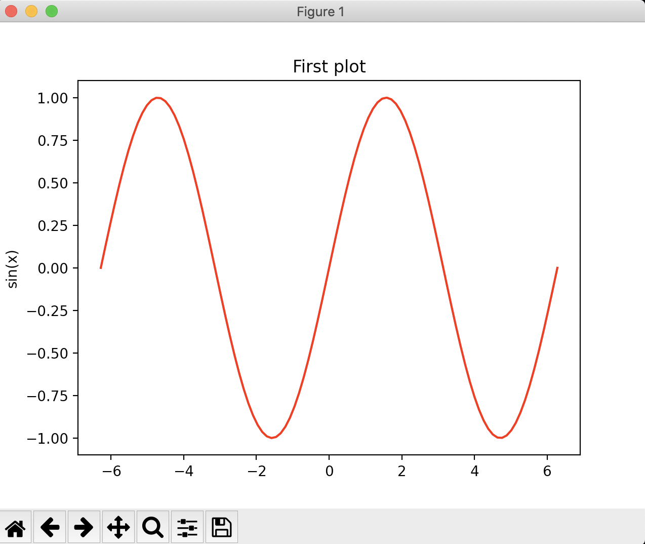
The basic structure of this example is that we generate some data, then we call functions to plot the data and configure the plot. There is a global concept of “the active plot”, and the functions do high-level manipulations on it. The generated plot is then usually saved to disk for inclusion in a journal article or presentation slides.
Now, as it so happens, the plot that opens does have some basic interactivity. You can pan, zoom, mess with layout, etc. But ultimately it’s a pretty static view into the data.
Application-oriented plotting
The chaco approach to plotting can be thought of as “application-oriented”, for lack of a better term. The code may appear a bit verbose given the simple plot it generates, but it sets us up to do more interesting things, as you will see later on:
1 2 3 4 5 6 7 8 9 10 11 12 13 14 15 16 17 18 19 20 21 22 23 24 25 26 27 28 29 | from numpy import linspace, sin from traits.api import HasTraits, Instance from traitsui.api import View, Item from chaco.api import Plot, ArrayPlotData from enable.api import ComponentEditor class LinePlot(HasTraits): plot = Instance(Plot) traits_view = View( Item('plot', editor=ComponentEditor(), show_label=False), width=500, height=500, resizable=True, title="Chaco Plot", ) def _plot_default(self): x = linspace(-14, 14, 100) y = sin(x) * x**3 plotdata = ArrayPlotData(x=x, y=y) plot = Plot(plotdata) plot.plot(("x", "y"), type="line", color="blue") plot.title = "sin(x) * x^3" return plot if __name__ == "__main__": LinePlot().configure_traits() |
This produces the following plot:
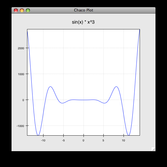
So, this is our first “real” Chaco plot. We will walk through this code and look at what each bit does. This example serves as the basis for many of the later examples.
Application-oriented plotting, step by step
Let’s start with the basics. First, we declare a class to represent our
plot, called LinePlot:
class LinePlot(HasTraits):
    plot = Instance(Plot)
This class uses the Enthought Traits package, and all of our objects subclass
from HasTraits.
Next, we declare a TraitsUI View for this class:
traits_view = View(
    Item('plot',editor=ComponentEditor(), show_label=False),
    width=500,
    height=500,
    resizable=True,
    title="Chaco Plot",
)
Inside this view, we are placing a reference to the plot trait and
telling TraitsUI to use the ComponentEditor (imported from
enable.api) to display it. If the
trait were an Int or Str or Float, Traits could automatically pick an
appropriate GUI element to display it. Since TraitsUI doesn’t natively know
how to display Chaco components, we explicitly tell it what kind of editor to
use.
The other parameters in the View constructor are pretty
self-explanatory, and the TraitsUI User Manual
documents all the various properties
you can set here. For our purposes, this Traits View is sort of boilerplate. It
gets us a nice little window that we can resize. We’ll be using something like
this View in most of the examples in the rest of the tutorial.
Now, let’s look at the constructor for the plot object we will display, where the real work gets done:
def _plot_default(self):
    x = linspace(-14, 14, 100)
    y = sin(x) * x**3
    plotdata = ArrayPlotData(x=x, y=y)
The first thing we do here is to create some mock data, just like
in the script-oriented approach. But rather than directly calling some sort of
plotting function to throw up a plot, we create this ArrayPlotData
object and stick the data in there. The ArrayPlotData object is a simple
structure that associates names with NumPy arrays.
In a script-oriented approach to plotting, whenever you have to update the data
or tweak any part of the plot, you basically re-run the entire script. Chaco’s
model is based on having objects representing each of the little pieces of a
plot, and they all use Traits events to notify one another that some attribute
has changed. So, the ArrayPlotData is an object that interfaces your
data with the rest of the objects in the plot. In a later example we’ll see
how we can use the ArrayPlotData to quickly swap data items in and
out, without affecting the rest of the plot.
The next line creates an actual Plot object, and gives it the
ArrayPlotData instance we created previously:
plot = Plot(plotdata)
Chaco’s Plot object serves two roles: it is both a container of
renderers, which are the objects that do the actual task of transforming data
into lines and markers and colors on the screen, and it is a factory for
instantiating renderers. Once you get more familiar with Chaco, you can choose
to not use the Plot object, and instead directly create renderers and containers
manually. Nonetheless, the Plot object does a lot of nice housekeeping that is
useful in a large majority of use cases.
Next, we call the plot() method on the Plot object we just
created:
plot.plot(("x", "y"), type="line", color="blue")
This creates a blue line plot of the data items named “x” and “y”. Note that
we are not passing in an actual array here; we are passing in the names of arrays
in the ArrayPlotData we created previously.
This method call creates a new renderer — in this case a line renderer — and
adds it to the Plot.
This may seem kind of redundant or roundabout to folks who are used to passing in a pile of NumPy arrays to a plot function, but consider this: ArrayPlotData objects can be shared between multiple Plots. If you want several different plots of the same data, you don’t have to externally keep track of which plots are holding on to identical copies of what data, and then remember to shove in new data into every single one of those plots. The ArrayPlotData object acts almost like a symlink between consumers of data and the actual data itself.
Next, we set a title on the plot:
plot.title = "sin(x) * x^3"
And then we set our plot trait to the plot we created by returning it:
return plot
The last thing we do in this script is set up some code to run when the script is executed:
if __name__ == "__main__":
    LinePlot().configure_traits()
This one-liner instantiates a LinePlot object and calls its
configure_traits() method. This brings up a dialog with a traits editor for
the object, built up according to the View we created earlier. In our
case, the editor just displays our plot attribute using the
ComponentEditor.
Scatter plots
We can use the same pattern to build a scatter plot:
1 2 3 4 5 6 7 8 9 10 11 12 13 14 15 16 17 18 19 20 21 22 23 24 25 | from numpy import linspace, sin from traits.api import HasTraits, Instance from traitsui.api import Item, View from chaco.api import ArrayPlotData, Plot from enable.api import ComponentEditor class ScatterPlot(HasTraits): plot = Instance(Plot) traits_view = View( Item('plot',editor=ComponentEditor(), show_label=False), width=500, height=500, resizable=True, title="Chaco Plot") def _plot_default(self): x = linspace(-14, 14, 100) y = sin(x) * x**3 plotdata = ArrayPlotData(x = x, y = y) plot = Plot(plotdata) plot.plot(("x", "y"), type="scatter", color="blue") plot.title = "sin(x) * x^3" return plot if __name__ == "__main__": ScatterPlot().configure_traits() |
Note that we have only changed the type argument to the plot.plot() call
and the name of the class from LinePlot to ScatterPlot. This
produces the following:
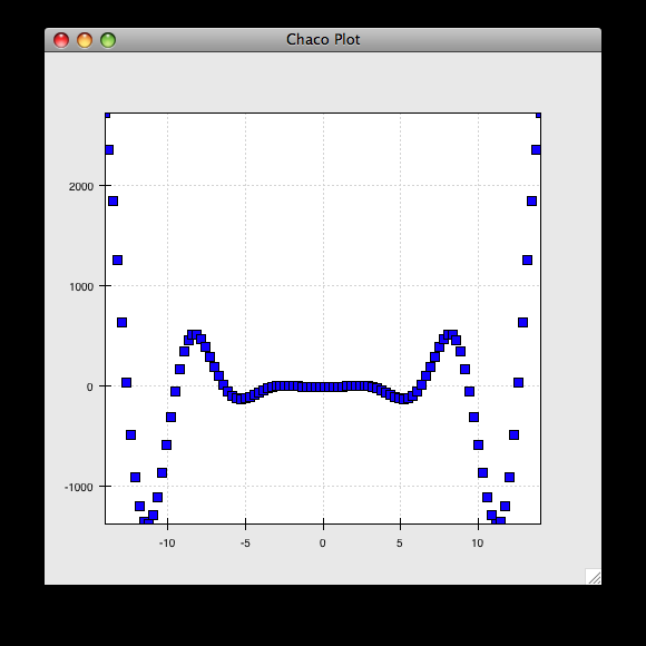
Image plots
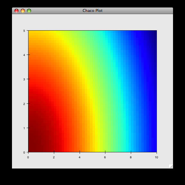
Image plots can be created in a similar fashion:
1 2 3 4 5 6 7 8 9 10 11 12 13 14 15 16 17 18 19 20 21 22 23 24 25 26 | from numpy import exp, linspace, meshgrid from traits.api import HasTraits, Instance from traitsui.api import Item, View from chaco.api import ArrayPlotData, Plot, jet from enable.api import ComponentEditor class ImagePlot(HasTraits): plot = Instance(Plot) traits_view = View( Item('plot', editor=ComponentEditor(), show_label=False), width=500, height=500, resizable=True, title="Chaco Plot") def _plot_default(self): x = linspace(0, 10, 50) y = linspace(0, 5, 50) xgrid, ygrid = meshgrid(x, y) z = exp(-(xgrid*xgrid+ygrid*ygrid)/100) plotdata = ArrayPlotData(imagedata = z) plot = Plot(plotdata) plot.img_plot("imagedata", colormap=jet) return plot if __name__ == "__main__": ImagePlot().configure_traits() |
There are a few more steps to create the input Z data, and we also call a
different method on the Plot object — img_plot() instead of
plot(). The details of the method parameters are not that important
right now; this is just to demonstrate how we can apply the same basic pattern
from the “first plot” example above to do other kinds of plots.
Multiple plots
Earlier we said that the Plot object is both a container of renderers and a
factory (or generator) of renderers. This modification of the previous example
illustrates this point. We only create a single instance of Plot, but we call
its plot() method twice. Each call creates a new renderer and adds it to
the Plot object’s list of renderers. Also notice that we are reusing the x
array from the ArrayPlotData:
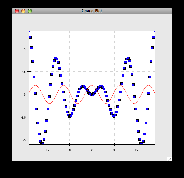
1 2 3 4 5 6 7 8 9 10 11 12 13 14 15 16 17 18 19 20 21 22 23 24 25 26 27 | from numpy import cos, linspace, sin from traits.api import HasTraits, Instance from traitsui.api import Item, View from chaco.api import ArrayPlotData, Plot from enable.api import ComponentEditor class OverlappingPlot(HasTraits): plot = Instance(Plot) traits_view = View( Item('plot',editor=ComponentEditor(), show_label=False), width=500, height=500, resizable=True, title="Chaco Plot") def _plot_default(self): x = linspace(-14, 14, 100) y = x/2 * sin(x) y2 = cos(x) plotdata = ArrayPlotData(x=x, y=y, y2=y2) plot = Plot(plotdata) plot.plot(("x", "y"), type="scatter", color="blue") plot.plot(("x", "y2"), type="line", color="red") return plot if __name__ == "__main__": OverlappingPlot().configure_traits() |
This code generates the following plot:
Containers
So far we’ve only seen single plots, but frequently we need to plot data side
by side. Chaco uses various subclasses of Container to do layout.
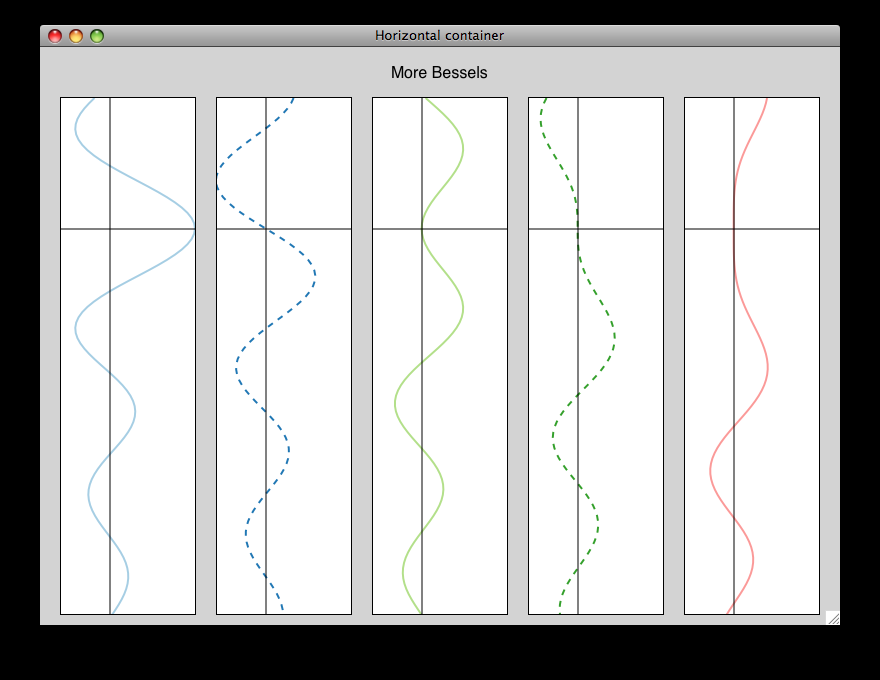
Horizontal containers (HPlotContainer) place components horizontally:
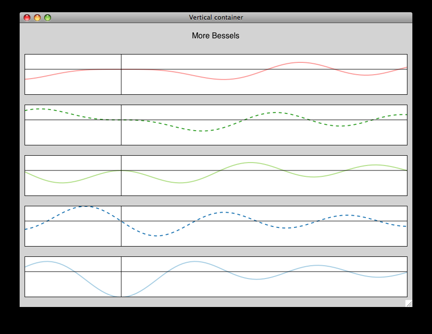
Vertical containers (VPlotContainer) place components vertically:
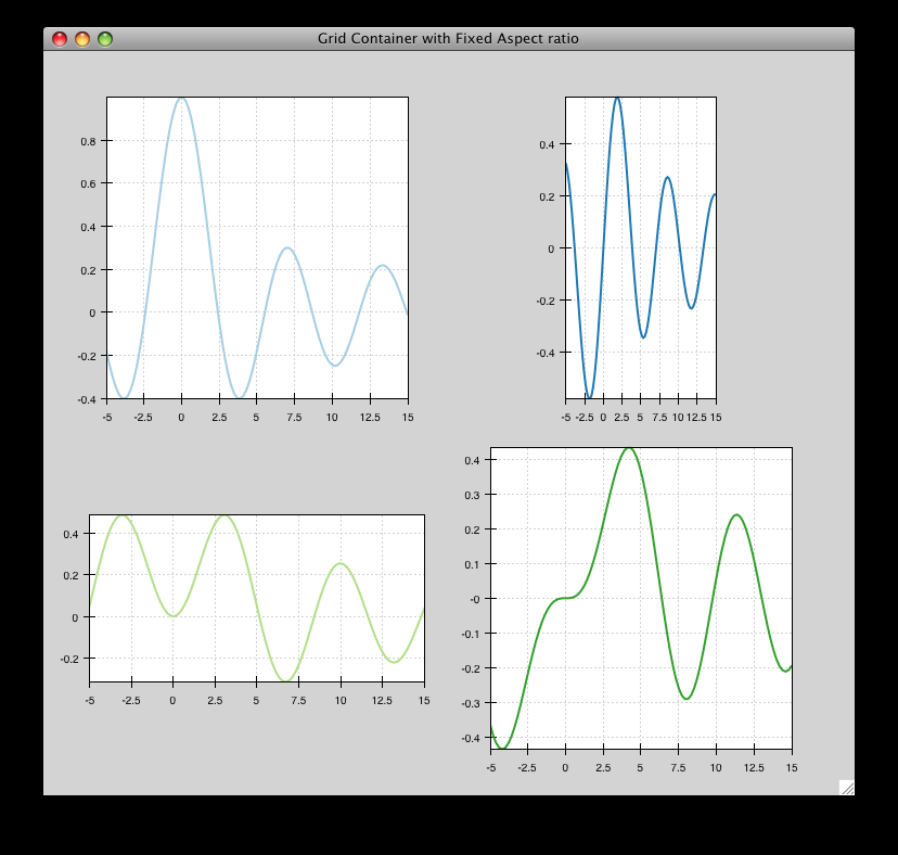
Grid container (GridPlotContainer) lays plots out in a grid:
Overlay containers (OverlayPlotContainer) just overlay plots on top of
each other:
You’ve actually already seen OverlayPlotContainer — the Plot class is actually a special subclass of OverlayPlotContainer. All of the plots inside this container appear to share the same X- and Y-axis, but this is not a requirement of the container. For instance, the following plot shows plots sharing only the X-axis:
Using a container
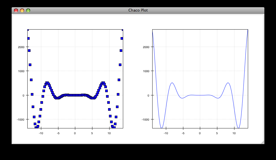
Containers can have any Chaco component added to them. The following code creates a separate Plot instance for the scatter plot and the line plot, and adds them both to the HPlotContainer object:
1 2 3 4 5 6 7 8 9 10 11 12 13 14 15 16 17 18 19 20 21 22 23 24 25 26 27 28 29 30 31 32 33 34 | from numpy import linspace, sin from traits.api import HasTraits, Instance from traitsui.api import Item, View from chaco.api import ArrayPlotData, HPlotContainer, Plot from enable.api import ComponentEditor class ContainerExample(HasTraits): plot = Instance(HPlotContainer) traits_view = View( Item('plot', editor=ComponentEditor(), show_label=False), width=1000, height=600, resizable=True, title="Chaco Plot", ) def _plot_default(self): x = linspace(-14, 14, 100) y = sin(x) * x**3 plotdata = ArrayPlotData(x=x, y=y) scatter = Plot(plotdata) scatter.plot(("x", "y"), type="scatter", color="blue") line = Plot(plotdata) line.plot(("x", "y"), type="line", color="blue") container = HPlotContainer(scatter, line) return container if __name__ == "__main__": ContainerExample().configure_traits() |
This produces the following plot:
There are many parameters you can configure on a container, like background
color, border thickness, spacing, and padding. We add additional code between
creating the HPlotContainer instance and returning the container to make
the two plots touch in the middle:
container = HPlotContainer(scatter, line)
container.spacing = 0

scatter.padding_right = 0

line.padding_left = 0
line.y_axis.orientation = "right"

return container
Something to note here is that all Chaco components have both bounds and padding (or margin). In order to make our plots touch, we need to zero out the padding on the appropriate side of each plot. We also move the Y-axis for the line plot (which is on the right hand side) to the right side.
This produces the following:
Dynamically changing plots
So far, the stuff you’ve seen is pretty standard: building up a plot of some sort and doing some layout on them. Now we start taking advantage of the underlying framework.
Chaco is written using Traits. This means that all the graphical bits you see — and many of the bits you don’t see — are all objects with various traits, generating events, and capable of responding to events.
We’re going to modify our previous ScatterPlot example to demonstrate some of these capabilities. Here is the full listing of the modified code:
1 2 3 4 5 6 7 8 9 10 11 12 13 14 15 16 17 18 19 20 21 22 23 24 25 26 27 28 29 30 31 32 33 34 35 36 37 38 39 40 41 42 43 44 45 46 47 48 | from numpy import linspace, sin from traits.api import HasTraits, Instance, Int from traitsui.api import Item, Group, View from chaco.api import ArrayPlotData, marker_trait, Plot from enable.api import ColorTrait, ComponentEditor class ScatterPlotTraits(HasTraits): plot = Instance(Plot) color = ColorTrait("blue") marker = marker_trait marker_size = Int(4) traits_view = View( Group( Item('color', label="Color", style="custom"), Item('marker', label="Marker"), Item('marker_size', label="Size"), Item('plot', editor=ComponentEditor(), show_label=False), orientation = "vertical", ), width=800, height=600, resizable=True, title="Chaco Plot", ) def _plot_default(self): x = linspace(-14, 14, 100) y = sin(x) * x**3 plotdata = ArrayPlotData(x = x, y = y) plot = Plot(plotdata) self.renderer = plot.plot(("x", "y"), type="scatter", color="blue")[0] return plot def _color_changed(self): self.renderer.color = self.color def _marker_changed(self): self.renderer.marker = self.marker def _marker_size_changed(self): self.renderer.marker_size = self.marker_size if __name__ == "__main__": ScatterPlotTraits().configure_traits() |
Let’s step through the changes.
First, we add traits for color, marker type, and marker size:
class ScatterPlotTraits(HasTraits):
    plot = Instance(Plot)
    color = ColorTrait("blue")
    marker = marker_trait
    marker_size = Int(4)
We also change our TraitsUI View to include references to these
new traits. We put them in a TraitsUI Group so that we can control
the layout in the dialog a little better — here, we’re setting the layout
orientation of the elements in the dialog to “vertical”.
1 2 3 4 5 6 7 8 9 10 11 12 13 | traits_view = View( Group( Item('color', label="Color", style="custom"), Item('marker', label="Marker"), Item('marker_size', label="Size"), Item('plot', editor=ComponentEditor(), show_label=False), orientation = "vertical", ), width=800, height=600, resizable=True, title="Chaco Plot", ) |
Now we have to do something with those traits. We modify the
constructor so that we grab a handle to the renderer that is created by
the call to plot():
self.renderer = plot.plot(("x", "y"), type="scatter", color="blue")[0]
Recall that a Plot is a container for renderers and a factory for them. When
called, its plot() method returns a list of the renderers that the call
created. In previous examples we’ve been just ignoring or discarding the return
value, since we had no use for it. In this case, however, we grab a
reference to that renderer so that we can modify its attributes in later
methods.
The plot() method returns a list of renderers because for some values
of the type argument, it will create multiple renderers. In our case here,
we are just doing a scatter plot, and this creates just a single renderer.
Next, we define some Traits event handlers. These are specially-named
methods that are called whenever the value of a particular trait changes. Here
is the handler for color trait:
def _color_changed(self):
    self.renderer.color = self.color
This event handler is called whenever the value of self.color changes,
whether due to user interaction with a GUI, or due to code elsewhere. (The
Traits framework automatically calls this method because its name follows the
name template of _traitname_changed.) Since this method is called
after the new value has already been updated, we can read out the new value just
by accessing self.color. We just copy the color to the scatter renderer.
You can see why we needed to hold on to the renderer in the constructor.
Now we do the same thing for the marker type and marker size traits:
def _marker_changed(self):
    self.renderer.marker = self.marker

def _marker_size_changed(self):
    self.renderer.marker_size = self.marker_size
Running the code produces an app that looks like this:
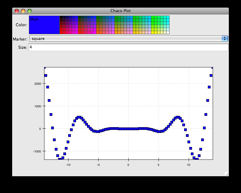
Depending on your platform, the color editor/swatch at the top may look different. This is how it looks on Mac OS X. All of the controls here are “live”. If you modify them, the plot updates.
Dynamically changing plot content
Traits are not just useful for tweaking visual features. For instance, you can use them to select among several data items. This next example is based on the earlier LinePlot example, and we’ll walk through the modifications:
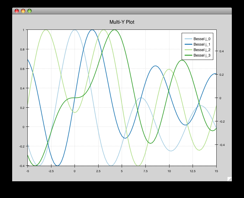
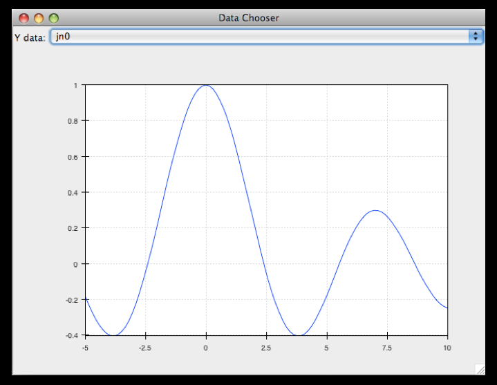
1 2 3 4 5 6 7 8 9 10 11 12 13 14 15 16 17 18 19 20 21 22 23 24 25 26 27 28 29 30 31 32 33 34 35 36 37 38 39 40 41 42 43 | from scipy.special import jn from numpy import linspace from traits.api import Enum, HasTraits, Instance from traitsui.api import Item, View from chaco.api import ArrayPlotData, Plot from enable.api import ComponentEditor class DataChooser(HasTraits): plot = Instance(Plot) data_name = Enum("jn0", "jn1", "jn2") traits_view = View( Item('data_name', label="Y data"), Item('plot', editor=ComponentEditor(), show_label=False), width=800, height=600, resizable=True, title="Data Chooser", ) def _plot_default(self): x = linspace(-5, 10, 100) # jn is the Bessel function or order n self.data = { "jn0": jn(0, x), "jn1": jn(1, x), "jn2": jn(2, x), } self.plotdata = ArrayPlotData(x=x, y=self.data["jn0"]) plot = Plot(self.plotdata) plot.plot(("x", "y"), type="line", color="blue") return plot def _data_name_changed(self): self.plotdata.set_data("y", self.data[self.data_name]) if __name__ == "__main__": DataChooser().configure_traits() |
First, we add an Enumeration trait to select a particular data name
data_name = Enum("jn0", "jn1", "jn2")
and a corresponding Item in the TraitsUI View
Item('data_name', label="Y data")
By default, an Enum trait will be displayed as a drop-down. In the
constructor, we create a dictionary that maps the data names to actual
numpy arrays:
# jn is the Bessel function of order n
self.data = {
    "jn0": jn(0, x),
    "jn1": jn(1, x),
    "jn2": jn(2, x),
}
When we initialize the ArrayPlotData, we’ll set y to the jn0 array:
self.plotdata = ArrayPlotData(x = x, y = self.data["jn0"])
plot = Plot(self.plotdata)
Note that we are storing a reference to the plotdata object.
In previous examples, there was no need to keep a reference around (except
for the one stored inside the Plot object).
Finally, we create an event handler for the “data_name” Trait. Any time the
data_name trait changes, we’re going to look it up in the self.data
dictionary, and push that value into the y data item in ArrayPlotData.
def _data_name_changed(self):
    self.plotdata.set_data("y", self.data[self.data_name])
Note that there is no actual copying of data here, we’re just passing around numpy references.
The final plot looks like this:
Connected plots
One of the features of Chaco’s architecture is that all the underlying components of a plot are live objects, connected via events. In the next set of examples, we’ll look at how to hook some of those up.
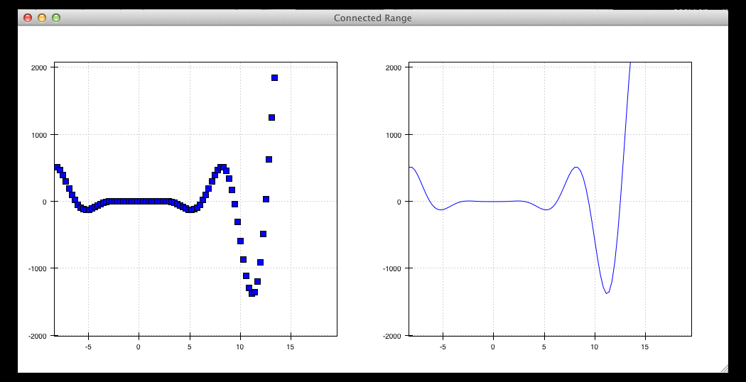
First, we are going to make two separate plots look at the same data space region. This is the full code:
1 2 3 4 5 6 7 8 9 10 11 12 13 14 15 16 17 18 19 20 21 22 23 24 25 26 27 28 29 30 31 32 33 34 35 36 37 38 39 40 41 42 43 | from numpy import linspace, sin from traits.api import HasTraits, Instance from traitsui.api import Item, View from chaco.api import ArrayPlotData, Plot, HPlotContainer from chaco.tools.api import PanTool, ZoomTool from enable.api import ComponentEditor class ConnectedRange(HasTraits): container = Instance(HPlotContainer) traits_view = View( Item('container', editor=ComponentEditor(), show_label=False), width=1000, height=600, resizable=True, title="Connected Range", ) def _container_default(self): x = linspace(-14, 14, 100) y = sin(x) * x**3 plotdata = ArrayPlotData(x = x, y = y) scatter = Plot(plotdata) scatter.plot(("x", "y"), type="scatter", color="blue") line = Plot(plotdata) line.plot(("x", "y"), type="line", color="blue") container = HPlotContainer(scatter, line) scatter.tools.append(PanTool(scatter)) scatter.tools.append(ZoomTool(scatter)) line.tools.append(PanTool(line)) line.tools.append(ZoomTool(line)) scatter.range2d = line.range2d return container if __name__ == "__main__": ConnectedRange().configure_traits() |
First, we define a “horizontal” container that displays the plots side to side:
container = Instance(HPlotContainer)

traits_view = View(
    Item('container', editor=ComponentEditor(), show_label=False),
    width=1000,
    height=600,
    resizable=True,
    title="Connected Range",
)
In the constructor, we define some data and create two plots of it, a line plot and a scatter plot, insert them in the container, and add pan and zoom tools to both.
The most important part of the code is the last line of the constructor:
scatter.range2d = line.range2d
Chaco has a concept of data range to express bounds in data space. There are a series of objects representing this concept. The standard 2D plots that we have considered so far all have a two-dimensional range on them.
In this line, we are replacing the range on the scatter plot with the range from the line plot. The two plots now share the same range object, and will change together in response to changes to the data space bounds. For example, panning or zooming one of the plots will result in the same transformation in the other:
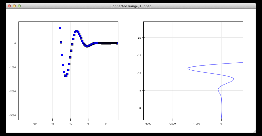
Plot orientation, index and value
We can modify the connected plots example such that the two plots only share one of the axes. The 2D data range trait is actually composed of two 1D data ranges, and we can access them independently. So to link up the x-axes we can substitute the line
scatter.range2d = line.range2d
with
scatter.index_range = line.index_range
Now the plot can move independently on the y-axis and are link on the x-axis.
You may have notices that we referred to the x-axis range as index range.
The terms index and value are quite common in Chaco:
As it is possible to easily change the orientation of most Chaco plots,
we want some way to differentiate between the abscissa and the ordinate axes.
If we just stuck with x and y, things would get pretty confusing after
a change in orientation, as one would now, for instance, change the y-axis
by referring to it as x_range.
Instead, in Chaco we refer to the data domain as index, and to the co-domain (the set of possible values) as value.
To illustrate how flexible this concept is, we can switch the orientation of the line plot by substituting
line = Plot(plotdata)
with
line = Plot(plotdata, orientation="v", default_origin="top left")
The default_origin parameter sets the index axis to be increasing
downwards. As a result of these changes, now changes to the
scatter plot index axis (the x axis) produces equivalent changes in the
line plot index axis (the y axis):
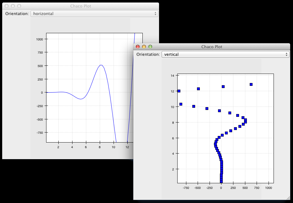
Multiple windows
Chaco components can also be connected beyond the boundary of a single window. We will again modify the LinePlot example. This time, we will create a scatter plot and a line plot with connected ranges in different windows.
First of all, we define a TraitsUI view of a customizable plot. This is the full code that we will analyze step by step below
1 2 3 4 5 6 7 8 9 10 11 12 13 14 15 16 17 18 19 20 21 22 23 24 25 26 27 28 29 30 31 32 33 34 35 36 37 38 39 40 41 | from numpy import linspace, sin from traits.api import Enum, HasTraits, Instance from traitsui.api import Item, View from chaco.api import ArrayPlotData, Plot from chaco.tools.api import PanTool, ZoomTool from enable.api import ComponentEditor class PlotEditor(HasTraits): plot = Instance(Plot) plot_type = Enum("scatter", "line") orientation = Enum("horizontal", "vertical") traits_view = View( Item('orientation', label="Orientation"), Item('plot', editor=ComponentEditor(), show_label=False), width=500, height=500, resizable=True, title="Chaco Plot", ) def _plot_default(self): x = linspace(-14, 14, 100) y = sin(x) * x**3 plotdata = ArrayPlotData(x = x, y = y) plot = Plot(plotdata) plot.plot(("x", "y"), type=self.plot_type, color="blue") plot.tools.append(PanTool(plot)) plot.tools.append(ZoomTool(plot)) return plot def _orientation_changed(self): if self.orientation == "vertical": self.plot.orientation = "v" else: self.plot.orientation = "h" |
The plot defines two traits, one for the plot type (scatter or line plot)
plot_type = Enum("scatter", "line")
and one for the orientation of the plot
orientation = Enum("horizontal", "vertical")
The plot_type trait will not be exposed in the UI, but we add a
TraitsUI item for the orientation:
traits_view = View(Item('orientation', label="Orientation"), ...)
Since the orientation trait is an Enum, this will appear as a drop-down
box in the window.
The constructor is very similar to the one used in the previous examples,
except that we create a new plot of the type specified in the plot_type
trait:
plot.plot(("x", "y"), type=self.plot_type, color="blue")
Finally, we wrote a Trait event handler for the orientation trait,
which changes the orientation of the plot as required:
def _orientation_changed(self):
    if self.orientation == "vertical":
        self.plot.orientation = "v"
    else:
        self.plot.orientation = "h"
The PlotEditor represents one window. When running the application,
we can easily create two separate windows, and connect their axes in
this way:
1 2 3 4 5 6 7 8 9 10 11 12 | if __name__ == "__main__": # create two plots, one of type "scatter", one of type "line" scatter = PlotEditor(plot_type = "scatter") line = PlotEditor(plot_type = "line") # connect the axes of the two plots scatter.plot.range2d = line.plot.range2d # open two windows line.edit_traits() scatter.configure_traits() |
In the last two lines, we open TraitsUI editors on both objects.
Note that we call edit_traits() on the first object,
and configure_traits() on the second object.
The technical reason for this is that configure_traits()
will start the GUI main loop, and therefore block the script until the
window is closed, whereas edit_traits() will not. Thus, when
opening multiple windows, we would call edit_traits()
on all but the last one.
Here is a screenshot of the two windows in action:
Plot tools: adding interactions
An important feature of Chaco is that it is possible to write re-usable tools to interact directly with the plots.
Chaco takes a modular approach to interactivity. Instead of being hard-coded into specific plot types or plot renderers, the interaction logic is factored out into classes we call tools. An advantage of this approach is that we can add new plot types and container types and still use the old interactions, as long as we adhere to certain basic interfaces.
Thus far, none of the example plots we’ve built are truly interactive, e.g., you cannot pan or zoom them. In the next example, we will modify the LinePlot example so that we can pan and zoom.
1 2 3 4 5 6 7 8 9 10 11 12 13 14 15 16 17 18 19 20 21 22 23 24 25 26 27 28 29 30 31 32 33 | from numpy import linspace, sin from traits.api import HasTraits, Instance from traitsui.api import Item, View from chaco.api import ArrayPlotData, Plot from chaco.tools.api import DragZoom, PanTool, ZoomTool from enable.api import ComponentEditor class ToolsExample(HasTraits): plot = Instance(Plot) traits_view = View( Item('plot',editor=ComponentEditor(), show_label=False), width=500, height=500, resizable=True, title="Chaco Plot", ) def _plot_default(self): x = linspace(-14, 14, 100) y = sin(x) * x**3 plotdata = ArrayPlotData(x = x, y = y) plot = Plot(plotdata) plot.plot(("x", "y"), type="line", color="blue") # append tools to pan, zoom, and drag plot.tools.append(PanTool(plot)) plot.tools.append(ZoomTool(plot)) plot.tools.append(DragZoom(plot, drag_button="right")) return plot if __name__ == "__main__": ToolsExample().configure_traits() |
The example illustrates the general usage pattern: we create a new instance of
a Tool, giving it a reference
to the Plot, and then we append that tool to the list of tools on the plot.
This looks a little redundant, but there is a reason why the tools
need a reference back to the plot: the tools use methods and attributes
of the plot
to transform and interpret the events that it receives, as well as act
on those events. Most tools will also modify the attributes on the plot.
The pan and zoom tools, for instance, modify the data ranges on the
component handed in to it.
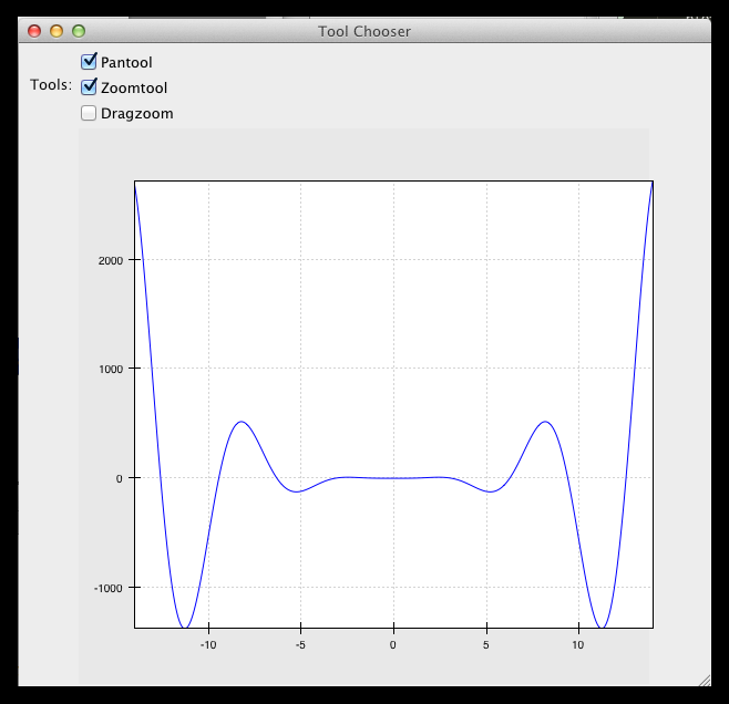
Dynamically controlling interactions
One of the nice things about having interactivity bundled up into modular tools is that one can dynamically control when the interactions are allowed and when they are not.
We will modify the previous example so that we can externally control what interactions are available on a plot.
First, we add a new trait to hold a list of names of the tools.
This is similar to adding a list of data items
in the DataChooser example.
However, instead of a drop-down (which is the default editor
for an Enumeration trait), we tell Traits that we would like a
check list by creating a CheckListEditor, so that we will be able
to select multiple tools. We give the CheckListEditor a list of possible
values, which are just the names of the tools. Notice that these are
strings, and not the tool classes themselves.
1 2 3 4 5 6 7 8 9 10 11 12 13 14 15 16 | from numpy import linspace, sin from traits.api import HasTraits, Instance from traitsui.api import CheckListEditor, Item, View from chaco.api import ArrayPlotData, Plot from chaco.tools.api import DragZoom, PanTool, ZoomTool from enable.api import ComponentEditor class ToolsExample2(HasTraits): plot = Instance(Plot) tools = List( editor=CheckListEditor( values = ["PanTool", "ZoomTool", "DragZoom"], ) ) |
In the constructor, we do not add the interactive tools:
1 2 3 4 5 6 7 | def _plot_default(self): x = linspace(-14, 14, 100) y = sin(x) * x**3 plotdata = ArrayPlotData(x = x, y = y) plot = Plot(plotdata) plot.plot(("x", "y"), type="line", color="blue") return plot |
Instead, we write a trait event handler for the tools trait:
1 2 3 4 5 6 7 8 9 10 11 | def _tools_changed(self): classes = [eval(class_name) for class_name in self.tools] # Remove all tools from the plot plot_tools = self.plot.tools for tool in plot_tools: plot_tools.remove(tool) # Create new instances for the selected tool classes for cls in classes: self.plot.tools.append(cls(self.plot)) |
The first line,
classes = [eval(class_name) for class_name in self.tools]
converts the value of the tools trait (a string) to a Tool class. In the
next part of the method, we remove all the existing tools from the plot
# Remove all tools from the plot
plot_tools = self.plot.tools
for tool in plot_tools:
    self.plot.tools.remove(tool)
and create new ones for the selected items:
# Create new instances for the selected tool classes
for cls in classes:
    self.plot.tools.append(cls(self.plot))
Here is a screenshot of the final result:
Writing a custom tool
It is easy to extend and customize the Chaco framework: the main Chaco components define clear interfaces, so one can write a custom plot or tool, plug it in, and it will play well with the existing pieces.
Our next step is to write a simple, custom tool that will print out the position on the plot under the mouse cursor. This can be done in just a few lines:
from enable.api import BaseTool

class CustomTool(BaseTool):
    def normal_mouse_move(self, event):
        print("Screen point:", event.x, event.y)
BaseTool is an abstract class that forms the interface for tools.
It defines a set of methods that are called for the
most common mouse and keyboard events. In this case, we define a callback
for the mouse_move event. The prefix normal indicated the
state of the tool, which we will cover next.
All events have an x and a y position, and our custom tools is
just going to print it out.
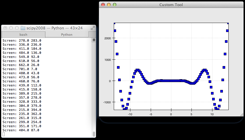
Other event callbacks correspond to mouse gestures (mouse_enter,
mouse_leave, mouse_wheel), mouse clicks (left_down, left_up,
right_down, right_up), and key presses (key_pressed).
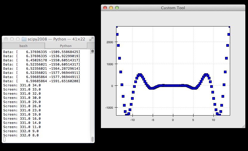
Stateful tools
Chaco tools are stateful. You can think of them as state machines that
toggle states based on the events they receive. All tools have at least
one state, called “normal”. That is why the callback in the previous
example began with the prefix normal_.
Our next tool is going to have two states, “normal” and “mousedown”. We are going to enter the “mousedown” state when we detect a “left down” event, and we will exit that state when we detect a “left up” event:
1 2 3 4 5 6 7 8 9 10 11 12 13 14 | class CustomTool(BaseTool): event_state = Enum("normal", "mousedown") def normal_mouse_move(self, event): print("Screen:", event.x, event.y) def normal_left_down(self, event): self.event_state = "mousedown" event.handled = True def mousedown_left_up(self, event): self.event_state = "normal" event.handled = True |
Every event has a handled boolean attribute that can be set to announce
that it has been taken care of. Handled events are not propagated further.
So far, the custom tool would stop printing to screen while the left mouse
button is pressed. This is because while the tools is in the “mousedown” state,
a mouse move event looks for a mousedown_mouse_move callback method.
We can write an implementation for it that maps the screen coordinates in
data space:
def mousedown_mouse_move(self, event):
        print("Data:", self.component.map_data((event.x, event.y)))
The self.component attribute contains a reference to the underlying
plot. This is why tools need to be given a reference to a plot when
they are constructed: almost all tools need to use some capabilities
(like map_data) of the components for which they are receiving events.
Final words
This concludes this tutorial. You can download a PDF version of the slides
For further information, visit the User Guide. You can find the examples
for this tutorial in the examples/tutorials/scipy2008/ directory of the
Chaco source code. You can browse it online in the
GitHub repository
if you don’t have a local copy. They are numbered and introduce concepts one at
a time, going from a simple line plot to building a custom overlay with its own
trait editor and reusing an existing tool from the built-in set of tools.
This tutorial is based on the “Interactive plotting with Chaco” tutorial that was presented by Peter Wang at Scipy
![]()
Table of Contents
- Interactive plotting with Chaco
- Overview
- Goals
- Introduction
- Script-oriented plotting
- Application-oriented plotting
- Application-oriented plotting, step by step
- Scatter plots
- Image plots
- Multiple plots
- Containers
- Using a container
- Dynamically changing plots
- Dynamically changing plot content
- Connected plots
- Plot orientation, index and value
- Multiple windows
- Plot tools: adding interactions
- Dynamically controlling interactions
- Writing a custom tool
- Stateful tools
- Final words